Set up a Website/Landing Page in Nexlvl Website Builder
Last Updated / Reviewed: July 26th, 2023
Execution Time: ~5-10 Mins

Goal: Set up a website/landing page that helps you gain potential customers by offering them a lead magnet in exchange for their email address.
Ideal Outcome: Successfully set up a website/landing page on Nexlvl that can help you generate leads with a lead magnet.
Prerequisites or requirements: A Nexlvl account.
Why this is important: A lead magnet website/landing page helps to drive brand awareness, promote your company and attract more customers by giving visitors a branded resource they can use.
Where this is done: Nexlvl CRM.
When this is done: After you’ve created a lead magnet that’s relevant to your audience.
Who does this: Marketing manager, marketing consultant, or any person responsible for marketing strategy for your business.
Set up a landing page for a lead magnet in Nexlvl
2. Click "Website" from the navigation bar.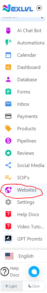
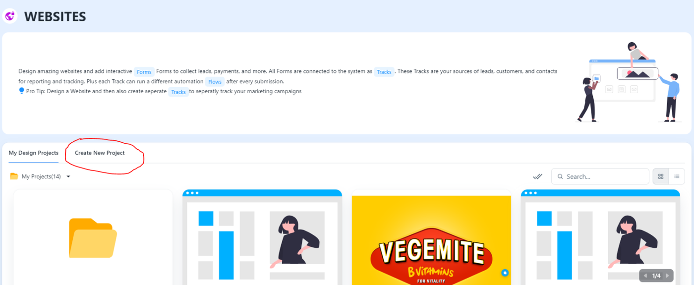
3. Click “Create New Project” from the dashboard.
4. Click “Website/Funnel or Landing Page”.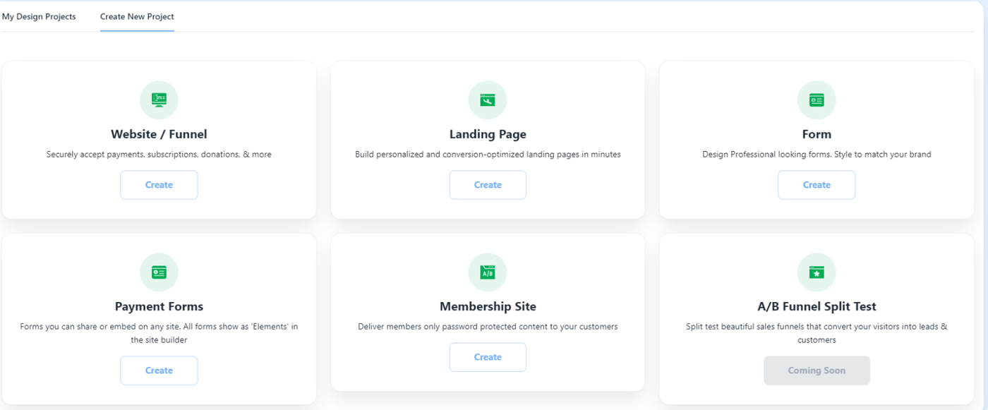
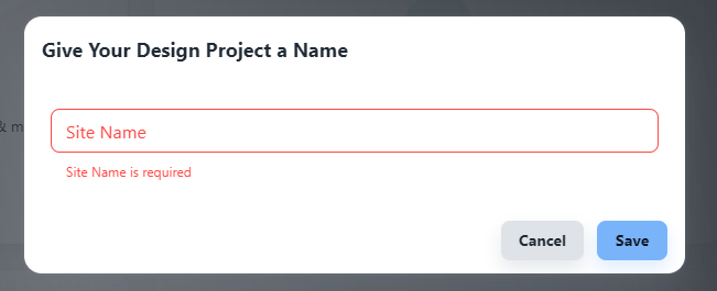
5. Create your "Site Name"
6. Choose a template or create your own by clicking "Empty Page".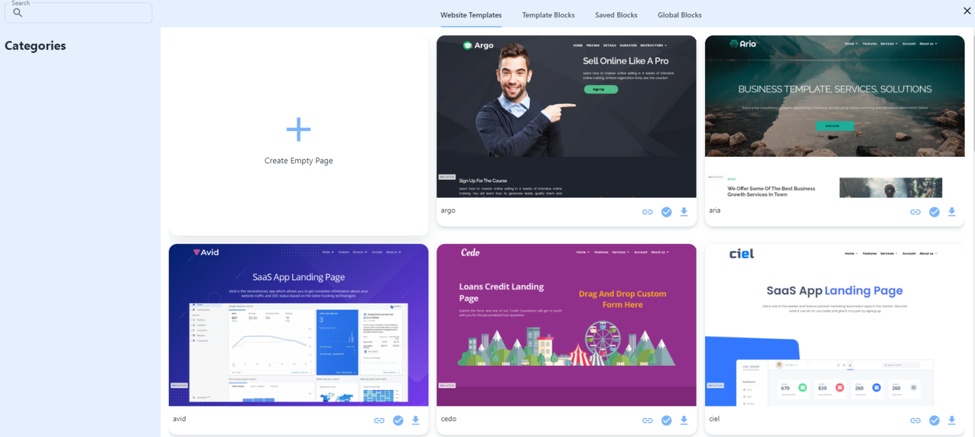 7. If you choose a template, pick the one you like and hit "Import this Template" and replace all the information you need to personalize like the logo, header and description, contact details and buttons.
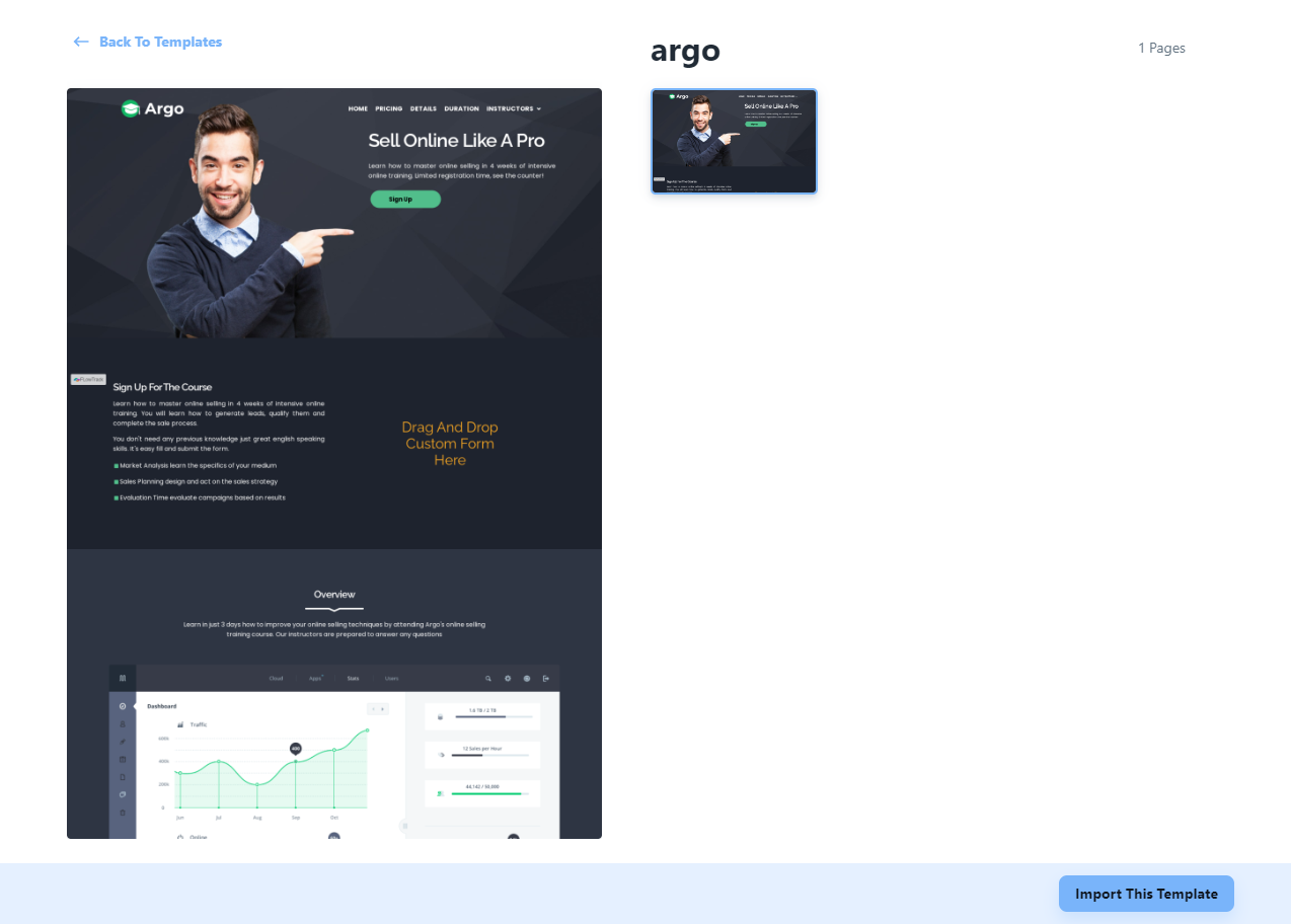
8. To start with a blank canvass, here are the following instructions:
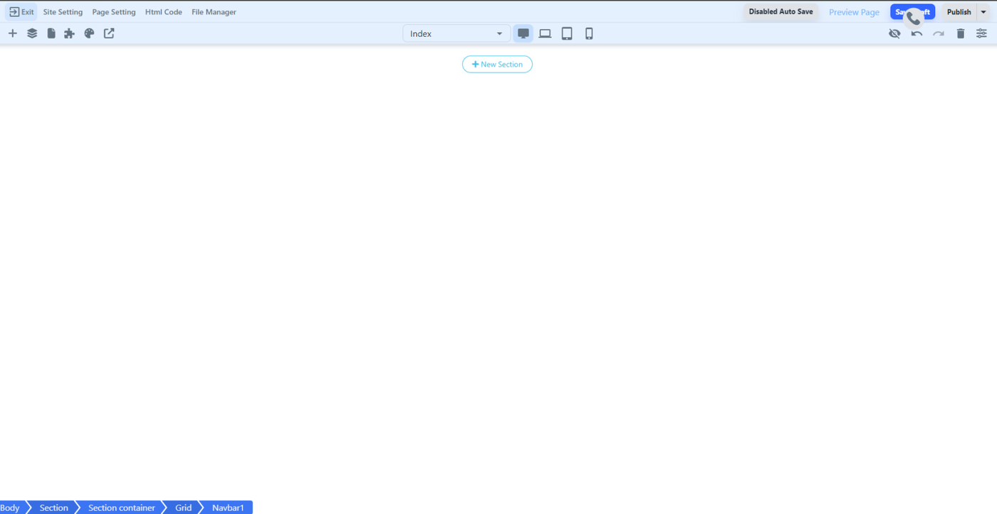
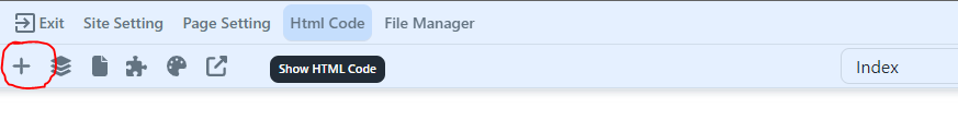
- Click the "Create Empty Page" and you will be directed to the page with an empty section

-
- Site setting - Where you modify the name of your site.
- Page Setting - Where you can name the pages you create. For instance, you might have a homepage, a pricing page, an about us page, and more. It's up to you to decide which pages you will create for your website.
- HTML Code - Used for building your website using HTML or CSS.
- File Manager - Where you can upload your images or files to use in building your website.
- Click on the plus icon to view the see the layout, elements, social, columnar, membership sites, and forms.
 LAYOUTS
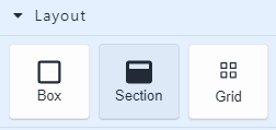
1. Box - Used to create a container for other elements. It helps in organizing and positioning content.
2. Section - A larger container that groups related elements together, often used to divide the page into different segments.
3. Grid - Allows you to arrange elements in rows and columns, creating a structured and responsive design.
ELEMENTS
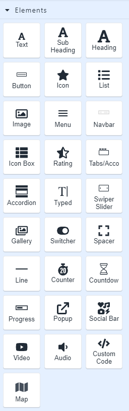
1. Text - Used to to display and style text content.
2. Sub Heading - A lower level of importance than the main heading.
3. Heading - Used to display headings or titles.
4. Button - A clickable element used for various calls-to-action, like submitting a form or navigating to another page.
5. Icon - A small graphical representation used to convey information or enhance the visual appeal of the content.
6. List - Used to display content in an organized list format, such as bullet points or numbered items.
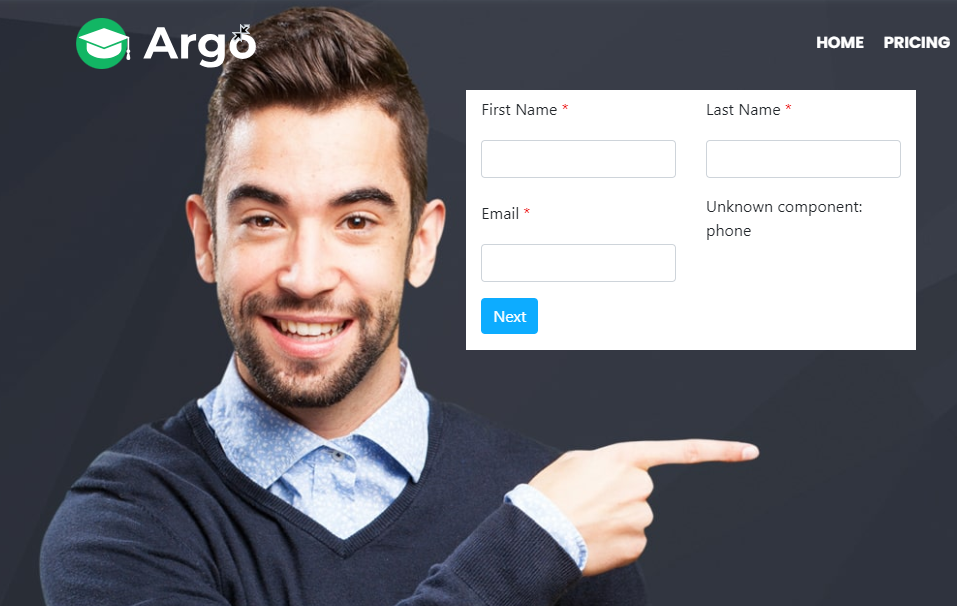
7. Image - Used to insert and display images on the web page.
8. Menu - Used to display a list of links to various sections or pages of the website.
9. Navbar - One of the most important element in a website where you typically placed at the top of the page for easy access to different sections of the website.
10. Icon Box - A combination of an icon and a text box, often used to highlight features or services.
11. Rating - Used to display your our client's rating or review score.
12. Tabs/Acco - Used for organizing content into tabs or collapsible sections, allowing users to view different content pieces.
13. Accordion - Displays collapsible sections of content.
14. Typed - Used to create animated typing effects to simulate text being typed out.
15. Swiper Slider - Used to display multiple images or content in a carousel fashion.
16. Gallery - Used to showcase a collection of images or media in a visually appealing manner.
17. Switcher - Used to toggle between two states, like an on/off switch.
18. Spacer - Used to add space between other elements.
19. Line - Used to create horizontal lines for visual separation or decoration.
20. Counter - Used to display numerical counters or statistics.
21. Countdown - Used to create a countdown timer for events or product launches
22. Progress - Used to show the progress of a task or process.
23. Popup - Used to display additional content in a modal or popup window.
24. Social Bar - Used to display social media sharing options or links.
26. Video - Used to embed and display videos on the web page.
27. Audio - Used to embed and play audio files on the web page.
28. Custom Code - Where you can insert custom HTML, CSS, or JavaScript code for advanced customization.
29. Map - used to embed maps or location information on the web page.
SOCIAL

1. Twitter - Where you can integrate Twitter feeds or allows users to share content on Twitter.
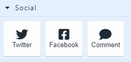
2. Facebook - Where you can integrate Facebook features or enables sharing on Facebook.
3. Comment - Allows users to leave comments on the web page, often used in blog posts or article.
MEMBERSHIP SITES
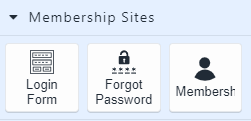
1. Login Form - Used to provide a login interface for members to access restricted content.
2. Forgot Password - Used to help members recover their forgotten passwords.
3. Membership Icon - An icon or graphical representation to signify membership-related actions or status.
OTHER ELEMENTS
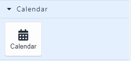
- Calendar - Used where clients can schedule appointments.

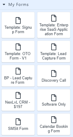
2. Forms - Where you can choose any from the existing form built inside the system and integrates it to the website.

- Here are the additional settings you can utilize inside the web builder.

1. Disabled Auto Save - An indicator if you want all changes made be autosaved or not. When you click that button, it will change to enable autosave which save your time hitting the save draft button manually.
2. Preview Page - Open a new browser tab where you can view your website in a client or website visitor view.
3. Save Draft - Is used to manually save the draft you made on the website.

9. Once done, click publish. This To allow the website be visible in public. 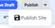
10. You’ve now set up your Nexlvl website/ landing page.